A full-scale rebrand is a perilous venture for any professional sports franchise. A misstep in a new color scheme or logo unveiling leaves your team subject to ridicule, destined to show up on some future list titled Top 10 Worst Uniforms in Sports History. It has the power to alienate your fans, making the sight of the new threads a source of shame instead of pride.
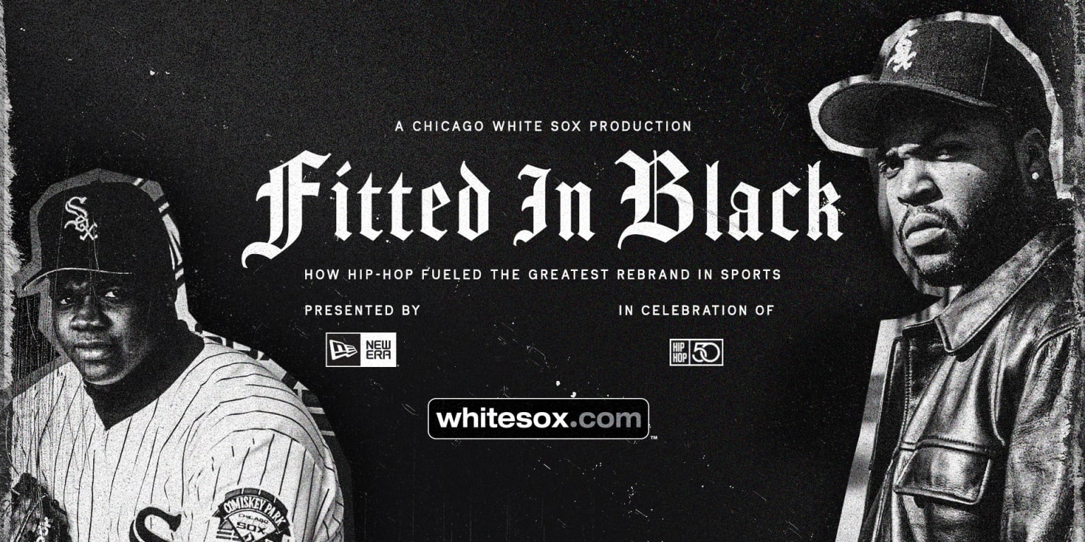
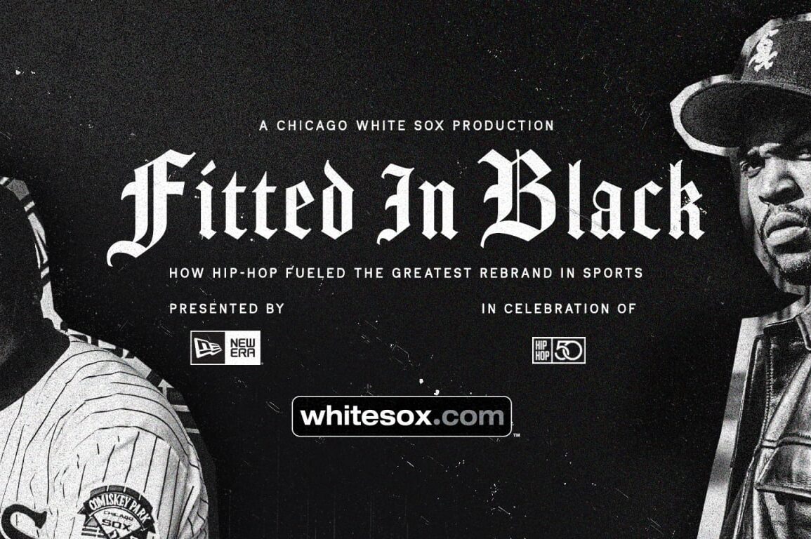
The potential pitfalls of this high wire act is what makes the White Sox 1990 rebrand — showcased in the “Fitted in Black” documentary — that marked the 50th anniversary of hip-hop a masterclass in reinventing yourself. A subtle change in calligraphy, a sleek new color palette slated for the future and a perfect storm in the West Coast Rap landscape helped power the White Sox hat to the forefront of culture (with a lot of help from Black/African American influence) — and back into the hearts of South Side Chicagoans.
“The hit man logo was probably the first instance of me loving the White Sox logos,” said Carrico “Kingdom Rock” Sanders, a lifelong White Sox fan and one of the founders of the Chicago Hip Hop Heritage Museum. “Then the rebranding came, and the way hip-hop adopted the White Sox logo, it was like a symbol of pride to all of us.”
Sanders fondly recalls growing up a stone’s throw away from Comiskey Park in the Ida B. Wells projects in Bronzeville, located just on the other side of the Dan Ryan Expressway. He would try to watch every game on TV, and when they played at home, he would race out of the house to catch the fireworks that signaled a White Sox victory.
But as deep as his love for his team ran through his veins, Sanders still recognized the wider perception surrounding his beloved South Siders, especially within his own city.
“I had a pride of my own for the South Side stadium,” he said. “But I went to school on the North Side, and the White Sox were always considered the second team, the bargain-basement brand of baseball in the city. But being a South Sider with that much pride in it, they couldn’t tell me anything about it.”
Luckily for Sanders and other White Sox fans who may have developed a slight inferiority complex due to years of playing second fiddle to the Cubs, the franchise’s 1990 rebrand provided an opportunity to instill a new sense of pride in the team.
It took precision and an eye toward the future with the new decade on the horizon, while also ensuring that lifelong fans still felt a connection to the past. Frank Thomas even went on record as calling the pre-rebrand uniforms outdated. In “Fitted in Black,” then director of marketing Mike Bucek and vice president of marketing Rob Gallas detailed the decision-making process behind abandoning the numerous red-and-blue uniform combinations of the 1970s and ’80s, and shifting the lettering of the logo to callback to Chicago’s bygone era in the ’50s.
Drawing on the classic Yankees “pinstripes” uniforms, they adopted white jerseys with black pinstripes for home games, and utilized the silver and black color scheme for the away and alternate jerseys. But the crown jewel of the rebrand — the move that cemented the White Sox in popular culture for the next three decades — was the revitalization of the Olde English logo, tweaking the Sox image and putting it on a black, fitted cap. The new hat and logo came at the perfect time.
“I think one of the things that’s really underrated about the cap is the clean design,” said Shakeia Taylor, a sportswriter with the Chicago Tribune who’s lived in the city since 2001. “It’s very clean. It’s super straightforward, it’s black, the letters are white. … And Olde English letters in the ’90s were really popular.
“People were getting Olde English tattoos. You had the nameplate jewelry where you could get your name in Olde English letters. I think that played a part.”
On the field, the rebrand occurred at the perfect time. With Thomas on the verge of blossoming into a gargantuan, Hall of Fame power threat, and veterans Tim Raines, Robin Ventura and Albert Belle stabilizing the lineup, the White Sox enjoyed a successful 1990s renaissance, finishing at least second in their division eight times in the decade. With slick new threads — and a brand-new stadium dubbed New Comiskey Park to boot — attendance numbers shot up on the South Side. In ’90, they ranked ninth in the American League in attendance. The following season, they shot up to second.
“That team was great, bro,” Sanders said. “I just wanted home runs, and I just got more home runs. They just inspired me to go out and play baseball or softball, which I still play to this day. … The Frank Thomas days lasted until now, like I’m still a fan.”
“Not only their personality, but the way that they played,” Taylor said. “With Frank Thomas … you’ve got this big guy who plays hard and hits very hard, rocking this jersey.”
But off the field, the White Sox cap was propelled to the peak of popular culture. West Coast Rap, with its titans hailing from the streets of Los Angeles, became a driving force behind what was cool in the late 1980s and ’90s. The likes of NWA, Snoop Dogg and Tupac flooded the airwaves and the “Billboard” charts, becoming cultural icons with millions wanting to dress and talk like them, rocking bandanas and black fitted caps with Raiders or L.A. Kings logos on them.
So when the new White Sox cap dropped, Ice Cube, Dr. Dre and Eazy-E started to don the new look — with Cube wearing it on magazine covers and Dr. Dre in the “Nuthin’ Like a G Thang” music video — its popularity spread in ways the franchise’s marketing department could never dream of. The hat’s sales skyrocketed, not only in the city, but across the country. In 1990, the New Era hat company made 9,000 White Sox hats. The next year, they made 544,000 to keep up with demand. Taylor, who grew up in Northeast Ohio recalls seeing the hat spread like wildfire.
“Obviously the White Sox are not loved in northeast Ohio,” Taylor said. “But West Coast rap was huge, in my little pocket [of the country]. … The White Sox pre-rebrand wasn’t really a thing that I saw. But post-rebrand, it was something that I saw constantly.”
But what drew rappers and regular folk alike to the hat, besides the Olde English lettering? The black-and-white combination’s ability to match with a wide range of outfits certainly helped. (“Black and white goes with everything … or most things,” Taylor said.) But the reality of 1990s American society was that gang affiliations turned color schemes into dividing lines. Certain colors, like red and blue, were treated as off-limits for civilians who wanted to not get pressed on the streets they walked through.
Black and white represented neutrality, a hat for everyone.
“I think there’s the unspoken thing,” Taylor said. “I remember growing up in the ’90s, and being fully aware of things you could not wear, or colors you couldn’t wear. People don’t like to glorify gang culture, and I’m not doing that. I’m just saying I recognize it.”
“The black and white was kind of a neutral pairing, so it made it the go-to hat for most people,” Sanders said.
So, the White Sox cap cemented itself into the pantheon of culture. When people discuss the greatest hats of all time, it doesn’t take long for the South Side fitted to get mentioned. The calligraphic styling of the Sox became a cultural touchstone, a reason for out-of-towners to think about the White Sox, if even for a brief moment.
To this day, countless celebrities still show out to Guaranteed Rate Field, decked out in endless variations of White Sox gear, a peak example of how baseball can affect fashion. It’s impossible to deny the hat’s influence, and what community had the biggest hand in helping it reach this status.
“I think Black culture was the driving force,” Taylor said. “Like I don’t want to take away from the designers, because they did a great job. … But for years, we’ve been the inspiration and purveyors of what is cool.”
This post was originally published on this site be sure to check out more of their content.


