Red Hood loses his ability to function and the baddies fight each other to get him back and it’s just a whole lotta nonsense from there. This mini-series is going out of its way to be crazy now and I’m kind of into it. At least I’m enjoying the absurdity a lot more than the initial issue. 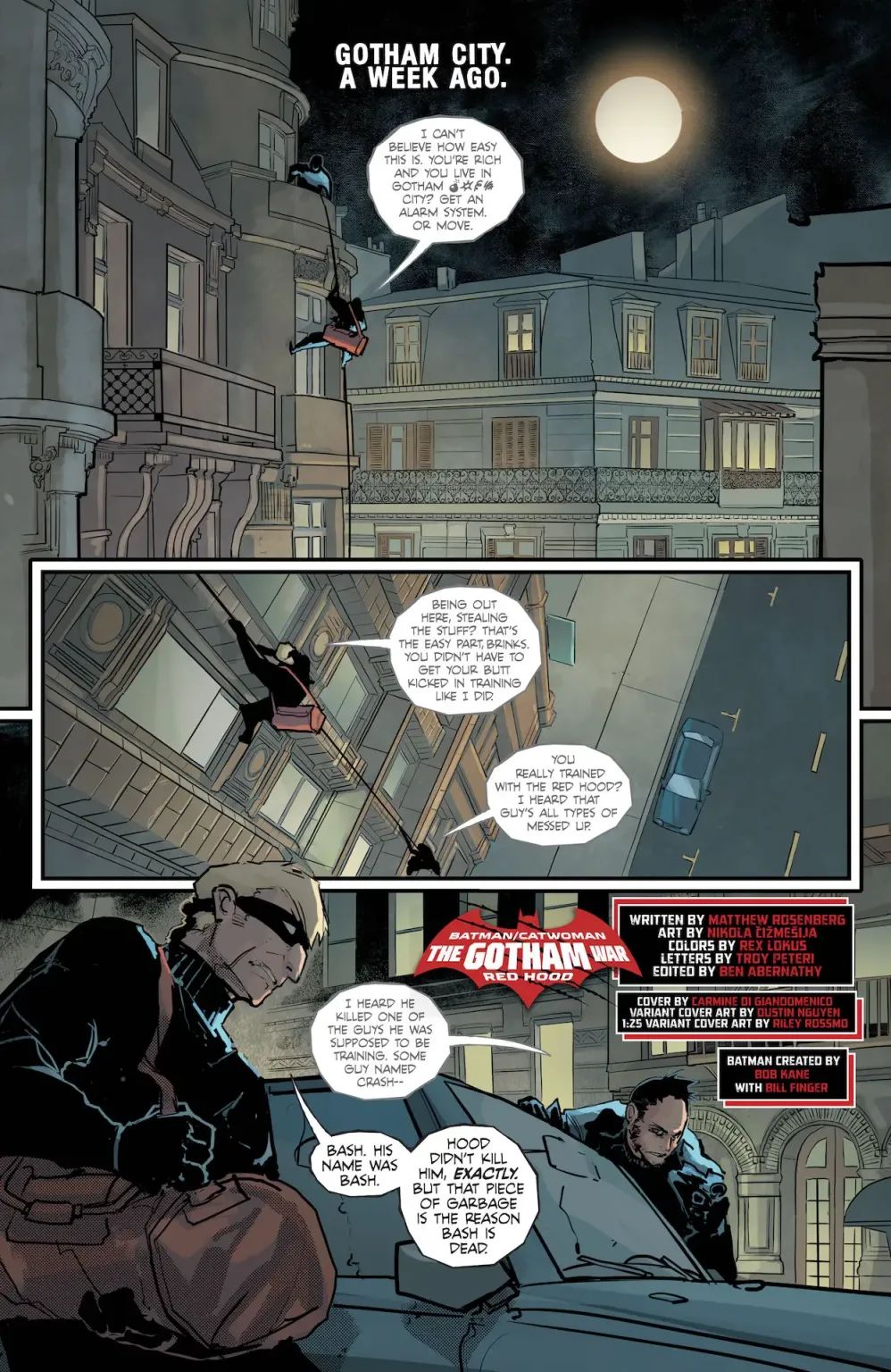
Does the craziness mean that the story is well written? That’s an interesting question honestly and I’m not really sure where I stand. I think that this issue is surprisingly entertaining but I don’t know how much of it is intentional. I love the way that the villains are acting towards each other and how their dynamic feels incredibly petty whenever Red Hood is involved, all of which is very intentional. The parts that really make it hilarious and jarring though is that this story is so random. Things just happen and unless you’re a die hard fan and know everything already then you’re probably just as lost as I am. The fact that there’s little to really follow and then you get these jarring scenes of crazy characters being petty doesn’t feel very intentional and yet it’s hilarious to me. Like shock value unfolding before your eyes from a comic that’s definitely not on my radar.
Does intent or lack of intent make good art though? Another question that plagues me as a reviewer. I love watching ‘so bad that it’s good’ movies and even if I think they’re trashy and that they work best when the author intended the movie to be their magnum opus, I also think it’s really hard to make something that’s entertaining and that good art should be captivating in some way. Making someone laugh, cry, roll their eyes, be angry or generally feel an intense emotion through any medium is a once in a lifetime opportunity and I have to admit that I laughed out loud at a couple parts in this comic. I think that the trash is on fire and I’m perfectly fine warming myself beside it. So hats off to the madness of Matthew Rosenburg who manages to add some spice in between the annoying reference to his other Joker comic and the complete lack of satisfying story progression.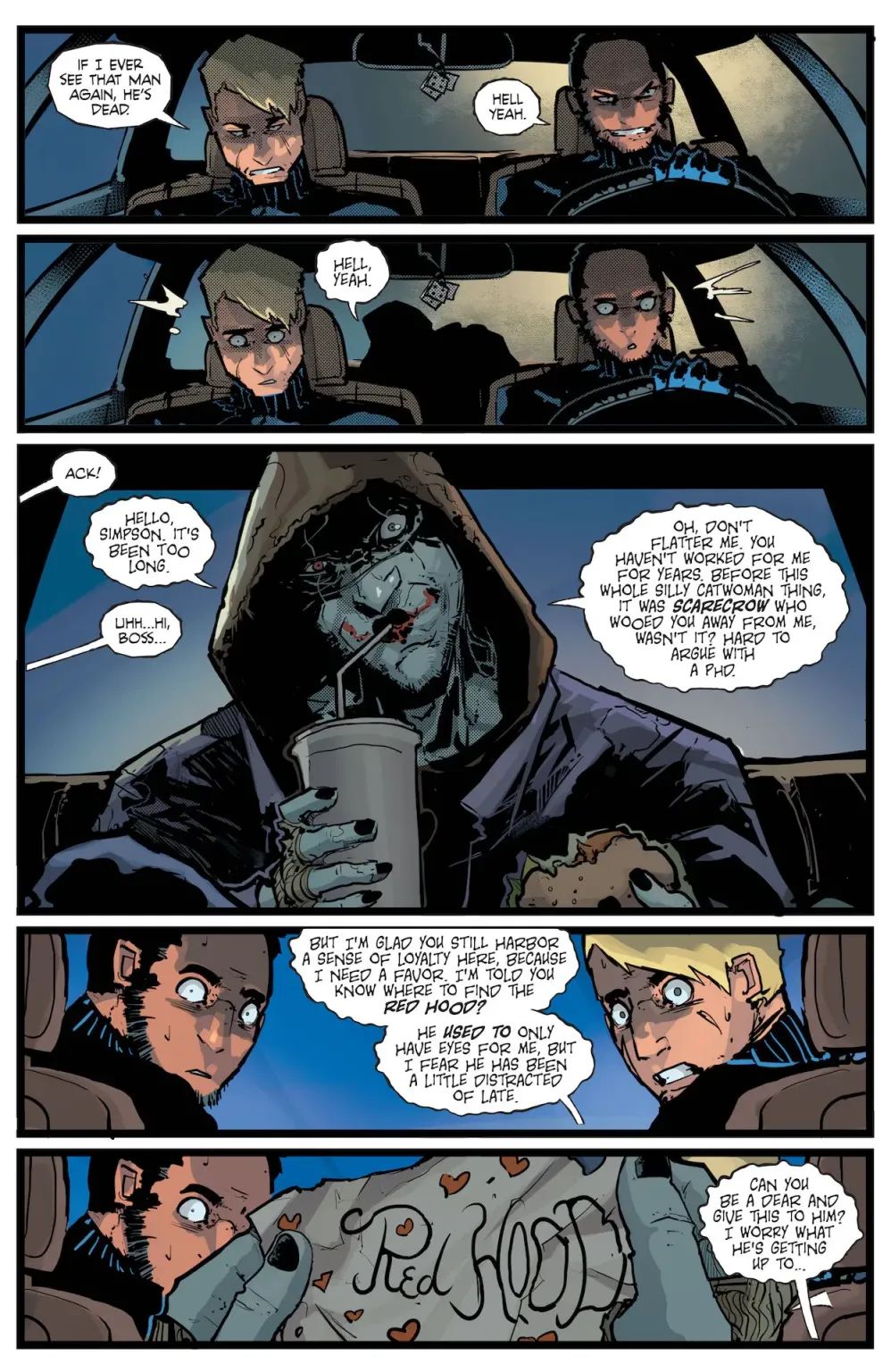
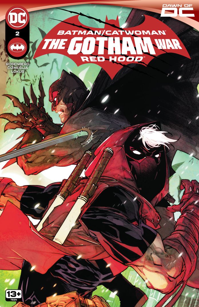
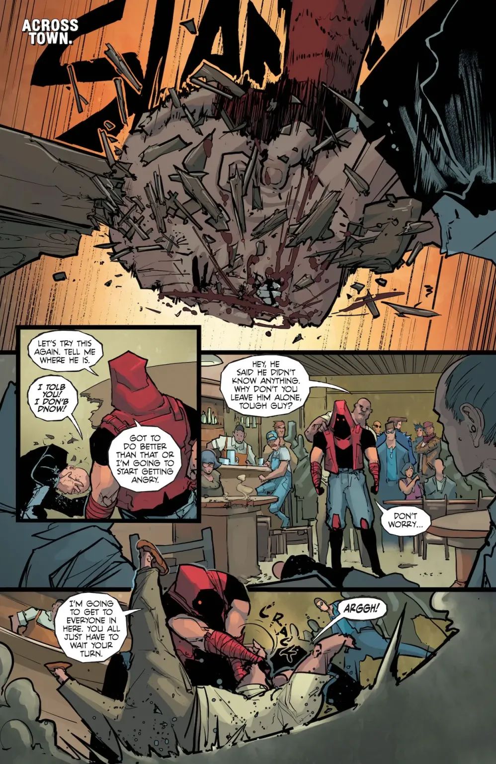
In the midst of this chaos is an incredibly solid looking Gotham by Nikola Čižmešija where the characters can roam around and burn it down. I like that a lot of the villains look like they’ve been designed to be the backup performers in a Gorillaz music video, it’s a kind of punk style that really clicks with my brain. You also get some scary pages that really let these villains impose themselves. The city has so much detail too, where you can easily situate yourself through looking at the page. A massive advantage if the writing was able to keep itself together enough to have you want to follow what’s going. I will give credit to both Rosenburg and Čižmešija for the fight scenes as they truly let the art breathe especially when those Red Hood beats to a pulp are barely left breathing.
The night sky in any comic by Rex Lokus is immediately recognizable to me. The way the moon slightly shimmers in the pitch blackness of it all is always breathtaking. The slightly dusty mixture of colors gives the backgrounds complex emotions where the characters are surrounded by the messiness and hectic planning of those around them. When the colors become more concrete it’s usually to showcase a still shot of a conversation or the radical burst of flame that flashes ferociously from page to page.
The letters by Troy Petteri are incredibly diverse in style. I love the color they have when the noise effects are present and it was really sick to see “YAAAWN” dissipate behind Catwoman as a contrast to the thick “SMASH” of a head against a table. The one problem I have is the way that Scarecrow and Joker have the same lettering. I think it works great for the Joker but it loses a bit of its value when it gets handed to the Scarecrow, especially when you have to follow both and you’re not exactly sure who said what.
Recommended if…
- You want a jarring comedy that gets the most surprising laughs out of you
- The craziness is a comfort after such a terrible initial issue
- The art, colors and lettering make you curious about what’s going on
Overall
Do I think this was a good second issue? No, I don’t think so. I think this is a terrible follow up to a stinker of an opening issue. But I was definitely entertained. The art was solid but the writing really surprised me. I think there’s some great things that kind of just appear and slap you in the face and the shock and sting seduce you into thinking this is going to get even saucier. I don’t know, maybe I’m the one going crazy after the deluge of mid comics I’ve had to read but at least this made me FEEL something and god that was a welcome addition to these reviews. I’m gonna give this a low score because I think this issue is nonsense but I would rather give it a good negative score (like a -6.5/10) for how fun it was in its own way.
Score: 4/10
DISCLAIMER: DC Comics provided Batman-News with a copy of this comic for the purposes of this review.
Check out my poetry dump account on Instagram: @trashskeletonpoems
This post was originally published on this site be sure to check out more of their content.